Galaxy Size Comparison Charts
Galaxies are quite big. But just how big, exactly ? The following charts attempt to give a better idea of this by comparing some well-known galaxies with our own Milky Way.
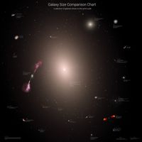
Giant Galaxies
These two charts show our Milky Way in comparison to galaxies even larger than our own. As I describe on my blog, while there are plenty of galaxies larger than us, most of them aren't massively larger than us, and the larger you go, the rarer they are. We're nowhere near the top of the tree, but we're even further from the bottom. The selection of galaxies was chosen based on image availability and to give a nice-looking image with lots going on, rather than trying to accurately represent the typical sorts of galaxy morphology.
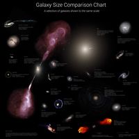
To show the very largest galaxies of all, it was necessary to zoom out and produce a second chart :
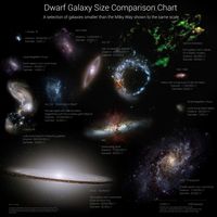
Small Galaxies
While astronomers normally use the terms "dwarf" and "giant", here I've been very liberal. These next two charts, one with and without the Milky Way, show galaxies smaller than our own. This is by no means the conventional definition of "dwarf" though ! More about the wonders of dwarf galaxies can be found on this blog post.
This first one includes the Milky Way, to give a better idea of their relative sizes :
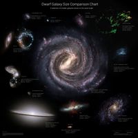
This second version does not. This means it's harder to put them in context, but you can see each galaxy in more detail :