Virgo Explorer
Pretty Pictures
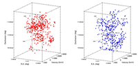
To help me understand my favourite galaxy cluster, I wanted a better visualisation of it than just the usual set of data points or a 2D map. So I created the Virgo Explorer, a combination of pretty pictures and hard data. I began with the pretty picture aspect. First, I downloaded images of all the (at that time) 781 galaxies in the cluster with known redshifts, giving them the appropriate size according to their optical measurements. This was all done using the GOLDMine data of the Virgo Cluster Catalogue, a uniquely detailed resource seldom available for other clusters. Then came the hard part, manually photoshopping out all foreground stars and other artifacts, leaving an image of the galaxy as it would appear in glorious isolation. With over 700 objects to work with, this isn't an experience I'd care to repeat.
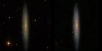
The colour difference in the above images is because I had to make this comparison using different SDSS data releases. Later data releases (i.e. left image) make things a lot redder and duller; in more recent projects I apply a colour correction to try and restore the earlier appearance.
The rest is relatively easy. Each image was imported as a textured plane at the corresponding position of the galaxy, using velocity as a proxy for distance, scaled to give the same depth as the physical width of the cluster. Now velocity is of course not a good indicator of distance in a cluster, but that's okay. Other measurements tell us the depth of the cluster is approximately equal to its projected radius across the sky, and that gives a convenient result for visualisation. What we get is something that's roughly correct on the large scale, and gives a good feel for the major structures present within the cluster (see below).
This was already a tedious enough process that I decided this level of accuracy was sufficient. I made only the most basic attempts to account for how individual galaxies are oriented. For elliptical galaxies (basically big balls of stars) I created three "billboard" images each at 90 degrees to each other, so that they're visible from any angle. For spiral galaxies I didn't, I just used a single image oriented towards Earth. In principle, for galaxies at moderate inclination angles, one could map the images to planes angled correctly and thus automatically correct for the distortion, at least to some extent. But this is not an inconsiderable amount of work, and then there'd be the question of what to do about the really edge-on cases.
The results were anyway adequate for my purposes. You can watch it in a video here :
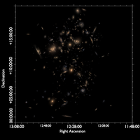
Or even interactively in the browser here ! Caution, 88 MB file. You can also see a simple 2D map I made using the same data below. This shows all the galaxies at their correct sky position, but greatly exaggerated in size, I think by a factor of 40.
Going fully interactive
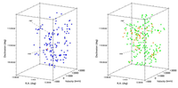
It's all very well having a 3D view of what a galaxy cluster really looks like (sort of), but what if you want to do actual science ? Sadly we astronomers do not sit around all day gawking at pretty pictures like intergalactic voyeurs. What we actually do is to look for trends in data, to see how one quantity varies with another.
To help me actually understand the cluster scientifically, for the offline .blend file I wrote a simple Python script that reads in the catalogue file from GOLDMine. You can choose which parameter you're interested in via a drop-down menu, and select (for example) all the galaxies with optical magnitudes brighter than whatever value. You can also display all the available information on a selected galaxy.
A slightly more advanced routine lets the user display galaxy properties by colour, rather than just selecting them as discrete variables. So, for example, if you want to look for a trend in galaxy morphology directly, rather than plotting any complicated morphology-density relation, you can do so. Another (less polished) script lets you colour according to one variable minus another, e.g. B-V magnitude – this what astronomers mean when they talk about colour.
To be honest I haven't looked at this in years. When I was doing nothing but Virgo stuff it was very useful, but these days I do other things as well, and I've looked at the data so much that the intuitive feeling is now deeply engrained. So although you can still download the .blend file here, I haven't updated it so it still requires the totally obsolete Blender 2.49 to run. And I can't guarantee that the scripts aren't riddled with bugs.
Vintage Virgo
But I'm far from done with Virgo ! My main COVID lockdown project was redecorating my home office into something less dominated by generic IKEA furniture. I really like the aesthetic of old maps, so I decided to make my own of the Virgo cluster. I wanted something that wouldn't look out of place in a room full of leather armchairs and men sipping brandy discussing a voyage to the Northwest Passage. Here's what I came up with :
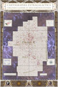
The detailing is a mixture of stuff I found on the internet and my own work. The portraits are of major figures involved in cataloguing and understanding the cluster : Charles Messier has his famous 18th-century galaxy catalogue, while Dreyer (thanks, temporary typo on Wikipedia entry for the NGC...) made the 19th-century New General Catalogue, while of course Bruno Binggeli and others created the Virgo Cluster Catalogue in the mid 1980s.
Creating a map of this format was not a small undertaking. Importing the data is simple enough, but multiple iterations of adjusting the sizes and moving the text was necessary to ensure that as many labels as humanly possible were visible – and indeed readable in its final giant poster format (it's about 90 x 120 cm, with the original render being 8k x 12k pixel resolution). Major structures were labelled from my own knowledge and figure 1 in Boselli et al. 2014. I even had to write some dedicated Python code to ensure the grid lines were plotted accurately, which was actually quite helpful. Normally I work with such small regions that the data can be approximated as Cartesian even though it's not really, and this much larger area forced me to confront the fact that the sky is spherical. So happily this led to me correcting a small but significant deficiency in the code I use regularly.
I'd love to expand on this to make it a full, proper atlas, showing the cluster in its different major components and with detailed close-ups of particular regions. And one day I'd like to have a map like this for all the AGES fields. We'll see.