FITS Files in Blender (2)
True volumetrics
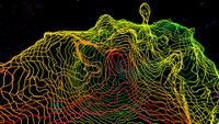
The early methods I used for viewing FITS files in Blender have severe limitations. The right way to view full volumetric data in Blender is actually comparatively simple : what you do is use a plane mesh with an image texture, mapping the image to both colour and transparency. This basic technique can be most clearly illustrated if we use the same image for each plane object :
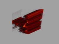
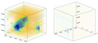
With the planes close together, it's almost impossible to tell that this isn't truly volumetric. In reality you use one plane per slice of the data, so each slice samples a different part of the data cube and you see the full volume. Of course the planes aren't visible if you view them directly edge-on, which does lead to some minor complications. You need to import three sets of planes, one from each major projection, to ensure the data is visible from every angle. Then you need a script that runs in the background, changing which group of slices you see depending on the current orientation of the view. And that's all there is to it. This method uses vastly less memory than importing the data as cube meshes.
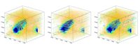
The only other slight complication is that the data for each projection is only shown correctly in the real time view from one direction – from the other side things look... ugly. The workaround for this is to duplicate the entire set of images, which forces a recalculation on the duplicates. So the background script chooses one set of images for one orientation and another for viewing from the reverse angle. This is an annoyance, but nothing more than that.
The main disadvantage of this method, the only serious drawback that I've found, is that in Blender < 2.8, you can't change the colour transfer function of the imported images : you have to know in advance what settings will work. This means that the full version of the code has gone through a lot of optimisation to make this as fast as possible (and includes many tricks to try and circumvent this limitation), because in some cases you can't avoid the need to re-render the images. Which is invariably slow, no matter how clever you are. This is not, however, the case in Blender 2.8 and above, which has a different, more powerful real time display capability.
A second, more minor disadvantage is also Blender-specific. The display is limited to showing the sum of the values along the line of sight, whereas fainters sources are often better revealed by the peak value (as shown for example in the iDaVIE viewer). Using a combination of viewing techniques can mitigate the impact of this, but it's still an irritation.
Finally, I should mention that the pixel size of the data must be constant. If a simulation uses adaptive mesh refinement, its data has to be regridded to the smallest pixel size you want to show, which is inefficient. In principle importing the data as meshes could overcome this, but the memory penalty for this more intensive method is so great I doubt there would be any advantage to it, at least not with Blender. This is a limit that only applies to numerical simulations though, as observational data doesn't have variable resolution elements.
Isosurfaces and contours
There's another way of visualising 3D data which I used to be skeptical of. Instead of trying to show the entire volume, you can just plot a surface of constant value. This is exactly the same as contour plots in 2D data, but now the surface spans a 3D space instead. I was skeptical because this of course greatly limits the amount of data shown, and feels almost like cheating... but actually it's very useful. Sometimes less really is more. By restricting your view to only values of the same significance level (S/N, see the data cleaning page), you can be absolutely sure that you're seeing real features and not some projection effect where the pixels line up to create the false appearance of a feature*. Removing all the rest of the data prevents a lot of the noise from getting in the way, which can often restrict the view rather than helping you find things.
* I'm saying "feature" here rather than "source". The point is only that you know the structure is really present in the data, not that it's necessarily astrophysical in origin.
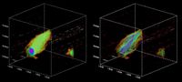
Taking this logic further, we can reduce isosurfaces back to a series of contours, one per slice of the data at a single fixed level. This is known as a renzogram, with each slice given a different colour. A necessary restriction is that unlike typical contour plots, generally only one contour per data slice is shown, otherwise things gets very confusing indeed.
You might think that this is a poor man's isosurface, but this is not so. Again the isosurface blocks the view of itself, whereas simple, thin contours do not. This means you can see at a glance whether the contours are truly circular in each channel and/or where any unusual bumps or extensions might be. It also lets you easily count how many channels show particular features, which can be essential for assessing their statistical significance. A continuous view might be prettier, but in this case, the real data is quantised.
Of course, both renzograms and isosurfaces do have a penalty for not showing all the data. At a single low level, contours like these will be good for finding faint objects but won't show you if the brighter gas is doing anything interesting. At higher levels you'll miss the faint sources. Both contours and volumes have their proper uses; neither is necessarily "better" than the other, they're both useful in their proper place.
Two-dimensional data
In contrast to volumetric data, importing 2D data is simplicity itself. Instead of importing multiple image planes, just one is needed per projection, which is given an animated image texture that's mapped only to colour. There's no reverse angle problem. There's still the limit that you can't change the CTF, but since only one image is loaded at any time, this reduces the loading time considerably.
There's also a neat trick you can do with 2D images that you can't with 3D volumes : you can use the image data as a heightfield (or height map or displacement map). That is, you turn the image plane into a grid and displace each vertex orthogonally by an amount corresponding to the data value at that region.
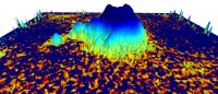
To be honest I added this to FRELLED just because it was so easy to do that it felt almost silly not to. It does have one significant advantage in that the dynamic range of the data becomes almost irrelevant. With 2D images you have to play with the CTF quite carefully to display data in which there are interesting features at flux values hundreds or thousands of times different from each other. With a heightfield there's no such limit, though it might get a bit inconvenient if some features are so displaced they're off the screen. But with Blender you can interactively rescale meshes, so this effectively avoids the CTF limit.
******
All this means that there is no one right or wrong way to view data, just techniques which are more appropriate for answering different questions. A volumetric display is no more the "real" view of the data than an isosurface is. To really maximise the scientific returns from the data set requires we use as many different inspection techniques as we can, as described in more detail on the source extraction page.