Mapping the Milky Way
On the Hydrogen Skies page I show some images of what the sky would look like if we could see the atomic hydrogen gas in our own Milky Way galaxy. This relies on using using different colours to represent the different frequency of the emission, which in turn depends on how fast the gas in moving along our line of sight. Panning through the frequencies across the whole sky, we get something like this :
This is using the HI4PI data set, considerably higher resolution than the LAB data I've used elsewhere. While it's fun to use frequency for colour like this, as I go on at length about in the abstract HI pages, this is arbitrary. Exactly how fast the gas is moving towards or away from us depends on its position in 3D space. This means that using the right equations we can reconstruct the true 3D structure of the disc. A full guide to how to do this, including code and equations, can be found on my blog, or see also the non-Cartesian data section. This page is the much shorter version.
Or... not ! First let's try something a bit simpler, because the velocity-distance transformation isn't easy. Let's start by pretending that velocity is directly equivalent to distance. Then we can map the HI onto a series of nested spheres, each one representing a slightly different distance. The result is something like this (or alternatively this) :
Why does it have this big bubble and flattened "wings" ? Well, we're inside a rotating disc, so there's gas all around us... but that's not really why we see such a bright bubble.
You might think that the further away the gas is, the harder it is to detect because it would appear fainter. Normally that's true, but in this unusual case, it doesn't really apply. The telescopes are so sensitive that we can detect gas equally well on the far side of the galaxy as we can nearby. What matters more is the velocity. Since we're in a rotating disc, the gas directly opposite us isn't moving at all. In effect, there's gas which isn't moving with respect to us in all directions. Hence, a big bright bubble.
It's actually much easier to work out the structure of external galaxies because we can just... well, look at them. Recreating the structure of our own Galaxy needs some trigonometry and there are some annoying limitations where the maths forbids us from calculating an exact solution for the distance, but nevertheless, it's possible. In infographic form the final map looks like this :
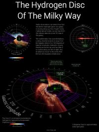
An interactive version is available here (31 MB file). This is actually an unfinished project though. I'd like to also include the High Velocity Clouds, which are HI clouds outside the galactic disc which can be at anything up to about +/- 300 km/s line-of-sight velocities. We don't have good distance data for these (the equations we use for the disc don't apply to the clouds), but some approximations could be made to at least get a feel for their positions on the sky.