H – One
This is my pretentious name for a sequence of images and videos I occasionally add to when I want to freely explore new visualisation techniques purely for the sake of it. Often new techniques aren't difficult to get working at a proof-of-concept stage, and all the prettiest pictures happen when you're free to make mistakes. I've been told by actual commercial artists that this definitely counts as art and that's more than good enough for me.
This all started with the following video I made right back in 2012 :
At the time I'd yet to find the almost-magical solution of using image planes to show volumetric data, so I was still importing FITS files with the earlier methods. None of these work well enough to make for anything useable scientifically, but some of them at least give aesthetically interesting results. There was no real thought behind this as a sequence at all, it was all constructed purely for the sake of "wouldn't this look pretty/interesting ?". If you watch it on YouTube, the description has a brief description of what each segment actually is.
Years later, having cracked the whole image plane solution, I was messing around with other techniques and decided I had enough to make a second video. Here there was much more a conscious philosophy behind the whole thing (which you can read about in much greater detail on my blog). I find it interesting how the same data can be depicted in radically different ways. What, pray tell, does this mean for the nature of reality ? Does everything depend on our perception ? Is everything made of the same mental "stuff" or is this of a fundamentally different nature to the material world ?
Look I DID bloody warn you it was pretentious. Anyway, though there isn't exactly a narrative structure to the video, it attempts to explore these ideas artistically. The two major themes are how the same data can be legitimately, meaningfully depicted in radically different ways (with the first few sequences all using the same data set), and how things can both be diffuse and without clear boundaries and yet also have hard, distinct edges.
Some of the techniques I developed for this have been incorporated into the latest version of FRELLED (in particular the landscape scenes), so yes, art can have direct value for science. It's under-appreciated that science has some fundamentally creative aspects to it, and it's absolutely essential that we have some space to think the unthinkable thoughts and make stupid mistakes. Especially when they result in pretty pictures.
One of the images from this now adorns the visitor office in the Astronomical Institute in Prague as a giant ~3m poster. I also made many other still images from this, some of which you can find below with brief descriptions, or again see the blog for full details, more images, and code. Some of these feature in the online gallery "Hybrid Science Experimentation", part of the continuous "Experimental Photo Festival".
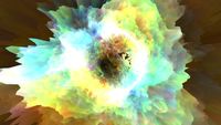
Too much information
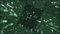
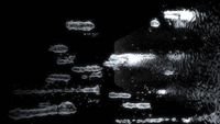
All the data is ultimately just numbers (or is it ? are numbers real ???), so ultimately the choice of how to depict the data is subjective. Different techniques convey different meanings, not only aesthetically, but also in what information the data reveals scientifically as well. This clichéd Matrix-style rendering shows an AGES data cube with all values in a data cube in a certain S/N range shown as text, with reflecting walls around the edge of the data to make it look infinite in scope.
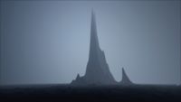
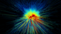
The Dark Tower
This render depicts a single velocity channel from the M33 AGES data cube, displacing each value according to its value. I genuinely had no idea there were multiple peaks in the data until I showed it like this : for standard images, the dynamic range is so high that the brightest data tends to saturate. The blue-grey bleakness was a happy accident; this foggy appearance results if you render inside a sphere and use ambient occlusion. I like the mixture of hard edges and blurriness here, and also just the idea of thinking of the data as a landscape, a real place we could go and explore.
Ghosts of Virgo
Continuing the landscape theme, this one is a combination of the above two techniques. The galaxies in an AGES data cube are shown as reflecting, transparent isosurfaces, with one particular velocity channel shown as a reflecting, displaced plane. Again this is an attempt to depict data which is both precise and diffuse at the same time.
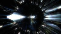
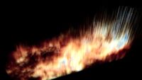
Crystalline Hydrogen
To really ram home the message that how we depict the data really fucking matters, and that data visualisation is important, here's the same M33 data set as above but rendered in a completely different way. Now we see it rendered as a volume, but with random slices of the data missing and the camera given an extreme wide field. The resulting appearance is something like an exploding crystal.
This idea of crystalline gas is developed further with a GALFA (galactic hydrogen) data cube. Here, instead of randomly omitting certain pixels, they are preferentially selected on one side. One side smoothly fades from ordinary, diffuse gas into something like a series of crystal shards, with no clear boundary between the two. Or at least that was the aim.
Chrysalis / Reality Bomb / Shattered Mirror
Now we come to the weird stuff. This is LAB data (all-sky HI) rendered on a displaced sphere, with a fisheye-style lens and reflecting spheres in the background, with lots of varying displacement and clipping effects. A lot of happy accidents here, which form the final and my favourite part of the video. Who needs drugs when you've got a radio telescope ?